Thursday, October 21, 2010

Chris Coumo's Hampton House From Elle Decor

I was really impressed with Chris Coumo's, from Good Morning America, Hampton home when it was published in Elle Decor a while ago. I came across the photos and thought I'd share.
The color palette and materials suggest a relaxed comfortable and breezy space. It reminds me of a lazy, breezy summer day!! (To put it in "designer" lingo :) ). One thing that I would love to see accompanying all interior photos in magazines, is a floor plan. I try to piece the homes together in my head, but sometimes they photograph portions of the rooms and I would like to see the progression of spaces!!


The sunroom. The Gray and the yellow are surprisingly fresh together!! Love the white trimmed furniture with the gold table; the warm color of the gold works so well with the cooler tones of the grays and whites because of the warm honey tone of the floor.
I love a settee!!! The fabric used here is sophisticated enough to stand up to the ornate trim on the settee, but modern enough to feel bold and fresh!!

What I love most about this living room is that it is a bold choice of colors, but it works because they are all in the same tonal family. You would not think that brown, magenta, olive green, yellow and soft grey would produce such a warm and sophisticated room, but they work very well together!! Notice how the drapes, wall color and the furniture and accessories along the wall are soft muted tones that blend well together as a backdrop; the furniture and accessories in the front are all rich tones of color that pop in the foreground. This careful and clever color play makes this a playful, yet very sophisticated room.

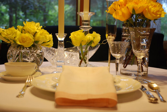
This is such a lovely vignette!! I wonder if this is the eating area and the chairs are pushed away for the photo, or if this is a display table and there is one beyond...... this is why I'd love to see a floor plan!! I really like the idea of having a "display" table between the kitchen and the eating area, it is very charming!!
Beautiful kitchen!!!

Monday, October 11, 2010

Tickled Pink.......


Canadian House and Home
October is National Breast Cancer Awareness Month; Its purpose is to increase the awareness of the disease and raise funds for research into its cause, prevention and cure. I have two survivors of the disease in my family, thanks to early detection. My Great Aunt Ginny was diagnosed at age 69 and this past July turned 100!!! It has been 7 years since my Grandmother's diagnosis and she is healthy and happy. This is a great cause to get behind because being aware is the first step to early detection.
The color pink has become synonymous with the fight for the cure for breast cancer as its symbol is a pink ribbon. Pink is associated with femininity; although I read that until 1940 it was used for boys (because it has a base of red, associated with masculinity) and blue was used for girls (because it's associated with the Virgin Mary and thus virginity)(I thought this was an interesting aside). In home decor pink is mostly thought of in little girls rooms or in outdated accents in the form of mauve (you remember mauve, that bluey pink way over used in the '80's). But pink can be flirty, soft, feminine, bold, electric, fun and sophisticated dependent upon its use. Pink can be a wonderful accent to a room. A brown sofa with soft pink pillows can be sophisticated and chic; bright pink upholstry on dining room chairs can be a bold and fun accent; Pale pink glassware, napkins and flowers can make a table girly and sweet; Pink peonies always add a pop of color appropriate for any room!!
Below are some photos I found of rooms with pink accents. As you can see, they all look fresh and inviting. Add a little hint of pink to your decor for October as a reminder of the good fight being fought against breast cancer and the brave women who have faced the disease. This can be as simple as a vase of flowers, a few accent pillows or glassware. Make pink your October luxury!!
Sarah Richardson Design
Elle Decor
Country Living
House Beautiful
House Beautiful
Canadian House and Home
Designers Guild

Decorpad
Sarah Richardson Design

Traditional Home

Sunday, October 10, 2010

My Perfect Fall Sunday........

To me, Sunday is all about family, friends and self reflection. Sunday is a day to enjoy your home and family, the one day of the week that everyone has fewer obligations and is able to spend together in the space you have created together. I love the thought of a leisurely Sunday lunch that is spent with the people you love, eating the food you love in a space that you love and make ready for that time. It is a day to relax and recharge for the week ahead. It is a chance to reflect on what you want the new week to be. Sundays should be filled with love, laughter and good times. I love Sunday!!
Here is a pictorial of how I dream my Sundays to be:

Living Room by Barbara Barry
Wake up to a beautiful room where I have sometime to myself while the house is quiet to have a cup of great coffee and read a book.


Pancakes by Martha Stewart
Have a breakfast of big fluffy pancakes with my family.

My Backyard
Spend sometime outdoors to enjoy the beauty of nature!!

Nino Salvaggios
Take my time at a great market browsing and collecting for a feast ahead!! Then spend the rest of the afternoon in the kitchen, lovingly preparing comfort food for my family to enjoy.

Salad by The Barefoot Contessa
We would start off with a simple salad

By The Barefoot Contessa
Then indulge in a big portion of cheesy lasagna.

By The Barefoot Contessa
Finish the meal with a decadent cake.

By The Barefoot Contessa
Served, of course, at a beautifully set table filled with laughter and good food.

Relax enjoying my favorite TV show, Madmen, before going off to bed.
I wish you a great Sunday!!! Enjoy!!

Friday, October 8, 2010

The Story of Flaming June......


Flaming June by Lord Frederic Leighton

When I was in graduate school I came across a print of Flaming June in a sale bin in an art museum gift shop. I was struck by the color and the composition of the piece and the $10 price tag was perfect for my budget. I had my first real job in an Architecture firm, that I worked during the day, and went to graduate school at night. During this time I had my first "real" apartment, in a building with a pool and a work out room, very different from the old houses converted to student apartments I lived in during my undergrad years. This was the first time I was able to start collecting my own new furniture and accessories and start to develop my own independent style. I had always loved the color seafoam green and added it as an accent around my apartment; I collected a set of mismatched wooden chairs from various estate sales and used furniture shops and painted them all seafoam green; While browsing these shops I discovered McCoy Pottery pieces in various shades of aquas and seafoam and started building the collection I have to this day. When I brought the print home, I was struck with how well the soft orange/apricot of her dress went with all my light greens!! The painting has a back ground of various green tones and the addition of the orange gives it a fresh, lively look.
I took my $10 print to a local framestore, I chose a beautiful guilded frame for the print, no mat. Being young, niave and a new home decor consumer, I didn't think to ask what it would cost. I went back to pick up my print a week later and the clerk said "that will be $400, please". I was agast!! How could the frame for my $10 print cost $400? On my limited budget and my graduate school expenses, I could not justify $400 for a frame. I told the clerk my prediciment, she told me that someone was admiring the print and they could sell the framed piece to her; I agreed, was given $10 for my print and walked away. A couple of years later, after graduating from school and getting married, I was driving by the same frame shop, I spotted Flaming June in the front window, in the frame I had selected!! Her price tag was $300, nobody had purchased her, she hung on the wall in the shop for a few years and was now on sale. I was planning on purchasing her with my next paycheck. A few days later, I came home to find Flaming June in my living room!!! My husband saw her in the window, knew the story of my missed purchase, and bought it for me. He said, "the print was meant to be yours!" Flaming June sits on the mantle in our living room to this day.
Flaming June brought to my attention a color combination I still love to this day, seafoam green and orange. It is both calming and electric; the soft hue of the light green with that pop of orange is very refreshing and refined. Thank you Flaming June!!! Thank you JT!!


Seafoam green and orange beautifully combined
in this room from Canadian House and Home.

A few vases from my McCoy collection with orange roses.

Monday, October 4, 2010

Starting Monday Off With A Room I Love......


Sloan Mauran's Living Room courtesy of SloanMauran.com


The above pictures are of Designer Sloan Mauran's Toronto living room. The entry to the room is in the middle and she has a seating area at either end. Sloan has said about her style "My look is sophisticated and tailored with a nod to the classics". I think that is a perfect description of this room. I first saw her home on an episode of Canadian House and Home's tv show. That was a few years ago when it was on HGTV; HGTV stopped airing the show, just like they do with any good design show they have on, but I digress......
I like her clean, tailored and modern approach to the design of this space. There is nothing fussy or complicated about this room. There are a lot of elements to the design of this room but by neutralizing them it becomes sophisticated and clean rather than busy and cluttered looking.
For example:
  • Painting the molding the same color as the wall gives it a clean and modern look.
  • A limited color palate combines the varying elements of the room. The two seating areas have different furnishings but are done in the same color palate; both sets of chairs are browns, the sofas are creams and the wood tables are dark. This makes the two separate areas of the room, a whole. If she would have had one side brights and the other neutrals the room would have seemed disconnected. This affect can be acheived with any color palate, as long as it is the same on both sides of the room.
  • The fireplace at one end of the room is balanced out by the statement art piece at the other end. The bold blue piece works well against the dark box of the fireplace and the large sculpture by it.
  • The amount of accessories are balanced on both sides of the room. The animal print on the stools is also balanced by the fur pillows on the sofa at the other end.
  • The room maintains symmetry at either end without being an exact replica. For example, both sofas are flanked by two side tables, two chairs and a coffee table, but are different on each side.

Modern Glam is my favorite style of design. I think the above room is a great example of that style. Looking at a beautifully designed room is my little luxury of the day. Enjoy!!

Tuesday, September 28, 2010

Furniture As Art

I took a little break from "blog land" this past week, now I'm back!! I thank all of you who have checked in during my absence and hope you will continue stop by!! I would love to hear comments from you!!

I have always been fascinated with furniture design. The Mid Century Modern period, from about 1933 - 1965, is synonymous with clean simplicity, geometry, visual lightness and experimentation with new materials such as metal, plywood and plastics. It was an exciting time in design with a lot of artists, craftsmen and architects experimenting with shape, form, function and materials redefining how we look at and feel about everyday objects.

A lot of furniture that came out of this period became instant classics, still highly recognizable and sought after today. Some of the more popular designs came from designers such as, Saarinen, Bertoia, Eames, Mies van der Rohe and Breuer. Their designs have a simplicity and timelessness that makes them still relevant in today's design world. You see their furniture used by many designers today mixed in with new pieces, but the Mid Century items appear as functional art. The "conversation piece" in the room that is both useful and beautiful.

I came across the work of a not as well known artist of this period, Gerald Summers. He designed The Bent Plywood Chair pictured below. Charles and Ray Eames are better known for their experimentation with bent plywood, during this period, creating beautiful furniture designs. The design of Summer's chair is breathtaking; it's clean curved lines and simple structure all created out of one piece of plywood, show that he was a true master of his craft. Summers was a carpenter that formed a furniture company in the 1930's called, Makers of Simple Furniture. The bent plywood chair was created in the 1930's and is his most recognizable piece. He is also known for his experimentation with Airplane Plywood, which is a high strength plywood made from mahogany and/or birch and uses adhesives with increased resistance to heat and humidity. So you know that the chair is not only beautiful but strong as well !! I would love to have this piece in my home, but found out that one just sold at Christie's for a cool $14,253 !!

I am very grateful for all the great artists and designers, of the past and present, that have created such works that continue to inspire and amaze. I hope to discover and share other lesser known gems, such as Summers, through my journey in design. Because to me, that is a great luxury!!!

Bent Plywood Chair by Gerald Summers. All chair photos from PeterPetrou.com


The gracefull curve and finish of Louboutin's Prorata pump in tortoise shell (from my collection),
reminds me of lines of the bent plywood chair. Fashion and interior design united!!!

Monday, September 20, 2010

My Ode to Monday..............


Today is Monday, it is the beginning of a whole new week; A week of possibility, a week of new beginnings, a week that can be anything you want it to be!! There is a Gaelic proverb that states, Monday is the key day of the week, I believe this to be true. Monday is the measuring stick for the rest of the week. If you perceive Monday to be bad, sluggish, full of angst, you will drag that attitude with you for the other 4 days. If you view your Monday as full of possibility and renewal, you will take that attitude with you for the other 4 days, being amazed at what you can find when you open your eyes!!
Monday is one of life's little luxuries!! It is a chance to start a new, take a step back and re evaluate what you would like the whole new week to be!! If you didn't like the way your last week went, too much work, too many crabby people, no time for yourself...... not to worry, you are still here and Monday is a whole other opportunity to start fresh. Monday is a day to start over, look at problems and anxieties in a whole other light. Set goals for the week ahead, tell yourself that everyday is full of possibility and Monday is just the beginning!! Start the week off with the best luxury of all, an attitude of grattitude!! Be thankful for Monday and have a beautiful day!!!